
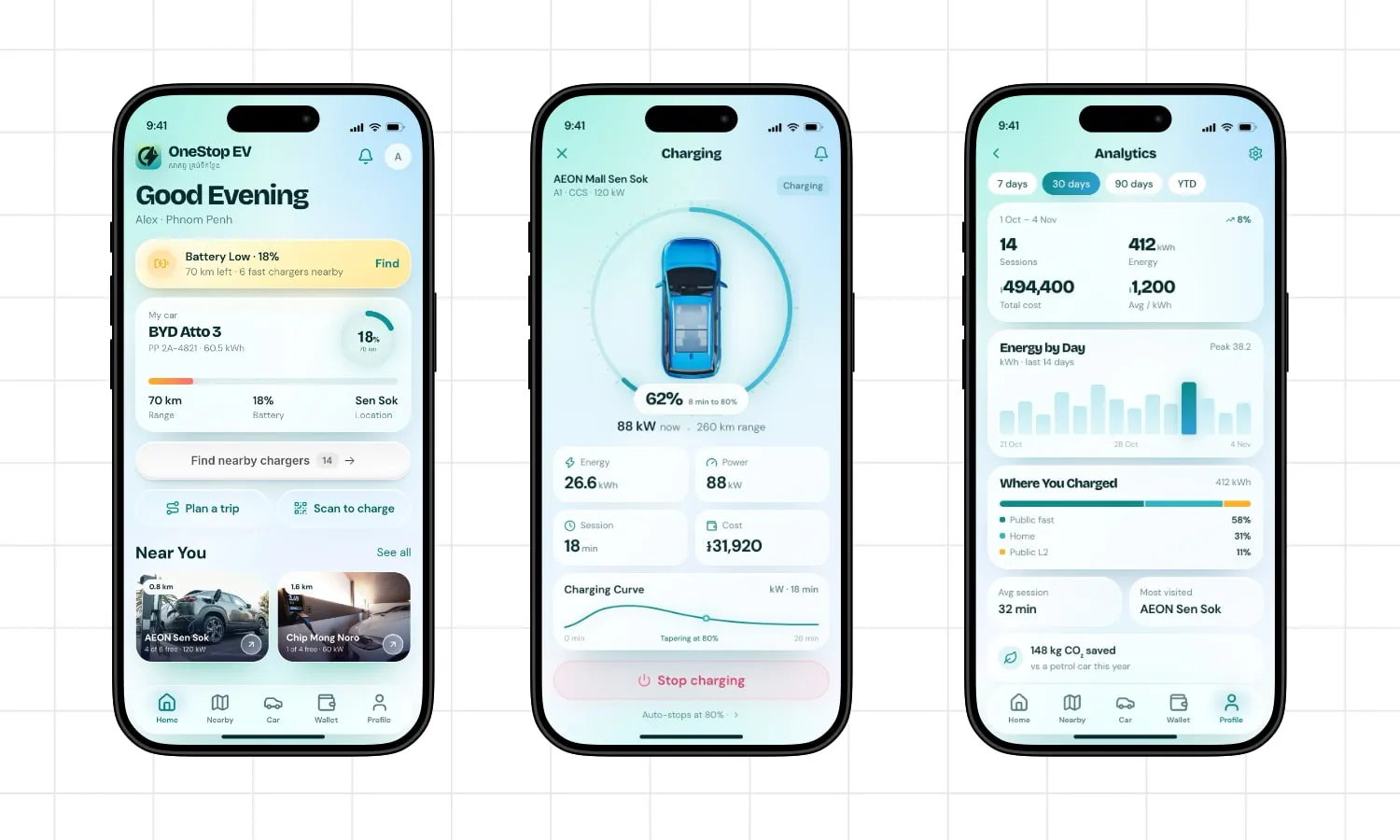
Fig. 1: Three of the six flows. Home, live charging, analytics.
For a new EV driver in Phnom Penh, the hard part comes after the car. Every trip carries the same question: can I make it home?
The app had to answer that in the few seconds before someone gets in the car, then stay out of the way until they need it again. Three frictions shaped the whole thing:
The sixth flow is the one nobody demos and everybody judges: the car, the wallet, the history. If those feel thin, the product feels like a prototype with a nice home screen.
This was also the first project where I tried agentic design tools. I used Doop through its MCP with Opencode and Deepseek v4.1 flash.
I used AI to get past the blank page, not to make the design decisions.
I wrote the spec (the flows, the screen list, the tone) and let the model produce the full set. It returned a complete product on the first pass, which was the point: a set of screens you could click through and judge, not a moodboard or a style tile.
What it couldn’t return was a point of view. The first version had a blue gradient behind everything, glassy cards with shadows on top of shadows, and a battery warning fighting the main button for attention. It looked like an app. It didn’t look like this app.
So the work became judgement rather than construction: what to keep, what to re-decide, what to delete. That was a better job than drawing rectangles.
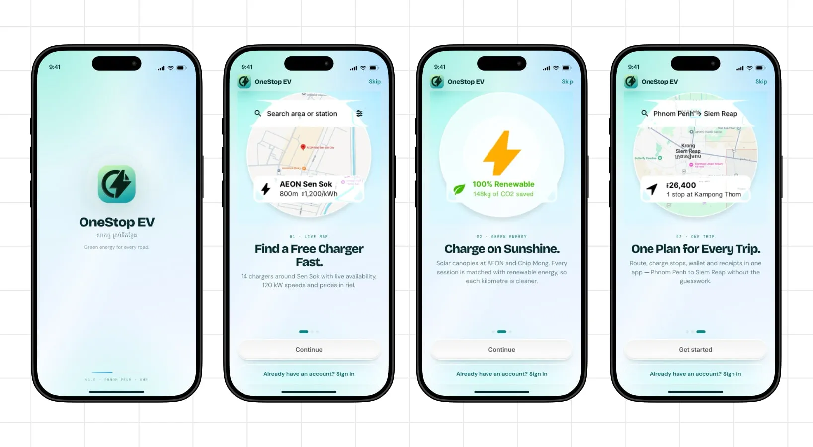
Fig. 2: Onboarding. Numbered chapters, real UI fragments, Skip always available.
Four screens: a title, then 01 · Live Map, 02 · Green Energy, and 03 · One Trip.
Each chapter shows a cropped piece of the real interface through a circular mask: the map with a live price, a charger card at 800 m for 1,200 riel/kWh, a trip summary from Phnom Penh to Siem Reap with one stop and a total. These aren’t illustrations of a phone. They are the phone, with the product inside it.
Why: an onboarding screen that shows the real product is also a preview of its density. If the app is going to be busy, say so on screen one and let people decide. A promise you break on screen four is worse than no onboarding at all.
The copy is specific for the same reason. “14 chargers around Sen Sok with live availability, 120 kW speeds and prices in riel” tells you more than “find chargers near you,” and it costs the same number of words.
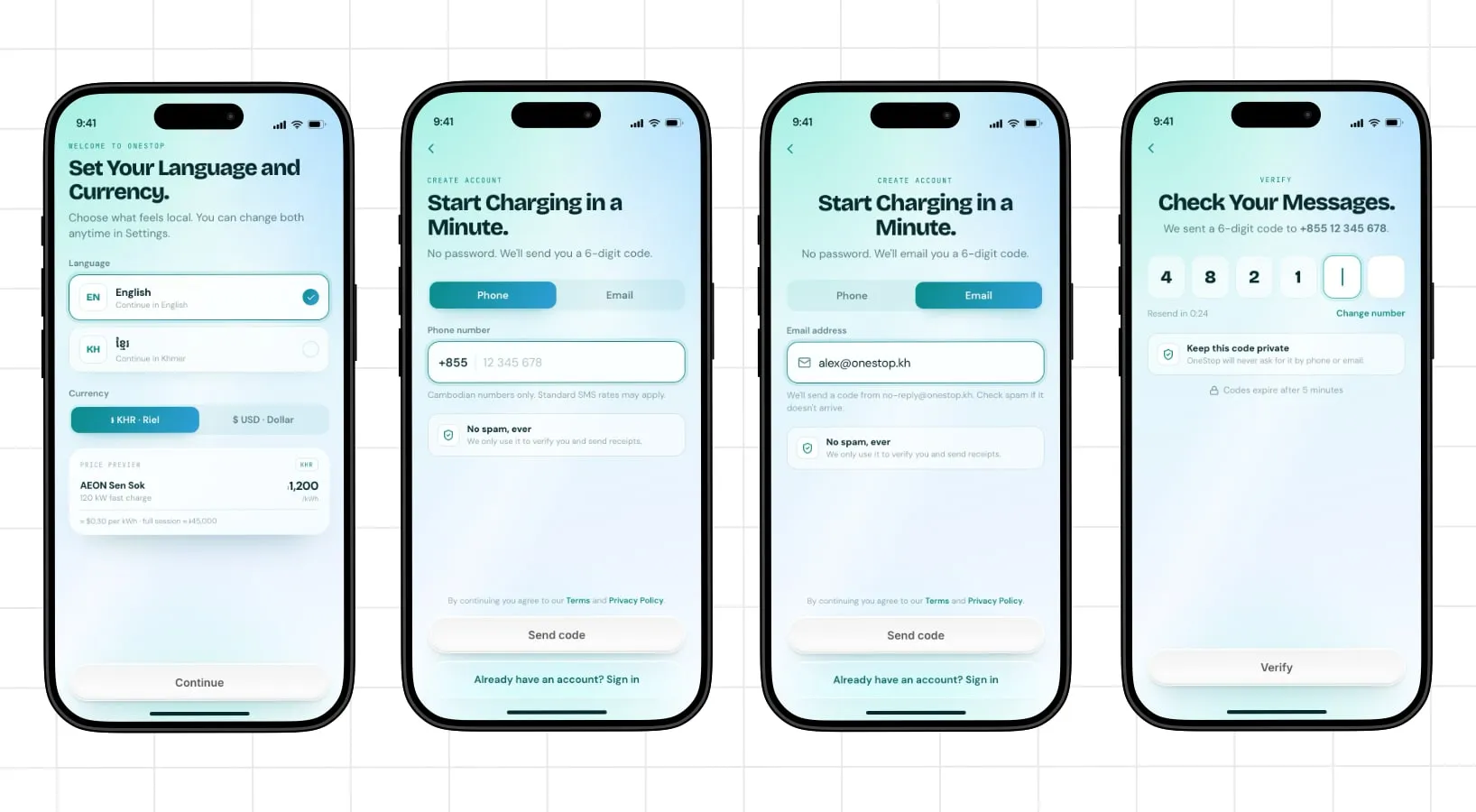
Fig. 3: Registration. Language and currency, passwordless entry, then the code.
Before any signup form, the app asks for language and currency: English or Khmer, riel or dollars, with a live price preview underneath. AEON Sen Sok at 1,200 riel/kWh, about $0.30, or roughly 45,000 riel for a full session.
Why: price is the trust question for a new user, and it is also a formatting question. Showing 1,200 riel and $0.30 side by side on the settings screen proves the app can speak both before anyone is asked for a phone number.
Then the form, which says what it is in the headline: Start Charging in a Minute. No password. A phone number or an email, +855 already in the field, and a reassurance block that reads No spam, ever. We only use it to verify you and send receipts.
Why: a password is a memory task, a recovery flow, and eventually a support ticket. An OTP is a task this audience has already performed a hundred times on other apps. One input per screen, numeric keypad by default, “Cambodian numbers only” so nobody types a landline.
The code screen finishes the job: six digits, a visible resend timer, Change number, “Codes expire after 5 minutes,” and one line that matters more than it looks: keep this code private; OneStop will never ask for it by phone or email. For a first-time user, that line is the difference between a security habit and a scam.
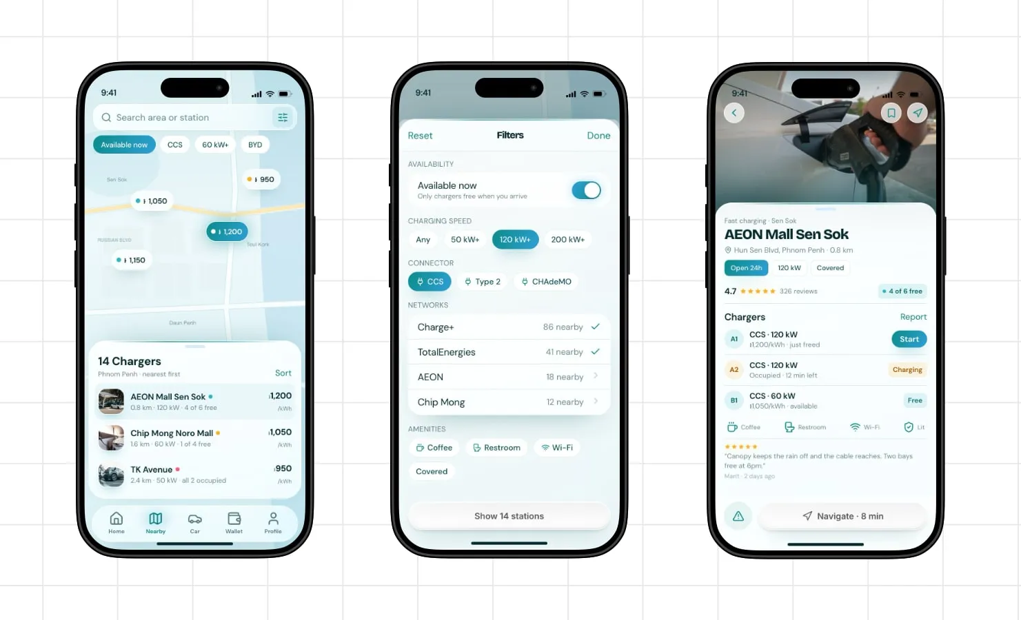
Fig. 4: Finding a charger. Price pins, chip filters, the full sheet, and per-connector status.
There are three routes to the same list, because drivers arrive with three different questions:
Available now defaults to on, and the sheet explains it in plain words: only chargers free when you arrive. If a charger is occupied, it doesn’t count.
The detail screen then answers the questions you only ask once you are standing there: which connector is free (A1 just freed, A2 occupied with 12 minutes left, B1 free), what the canopy situation is, whether there is a toilet. That last row of amenity chips isn’t decoration in a city where it rains in the afternoon.
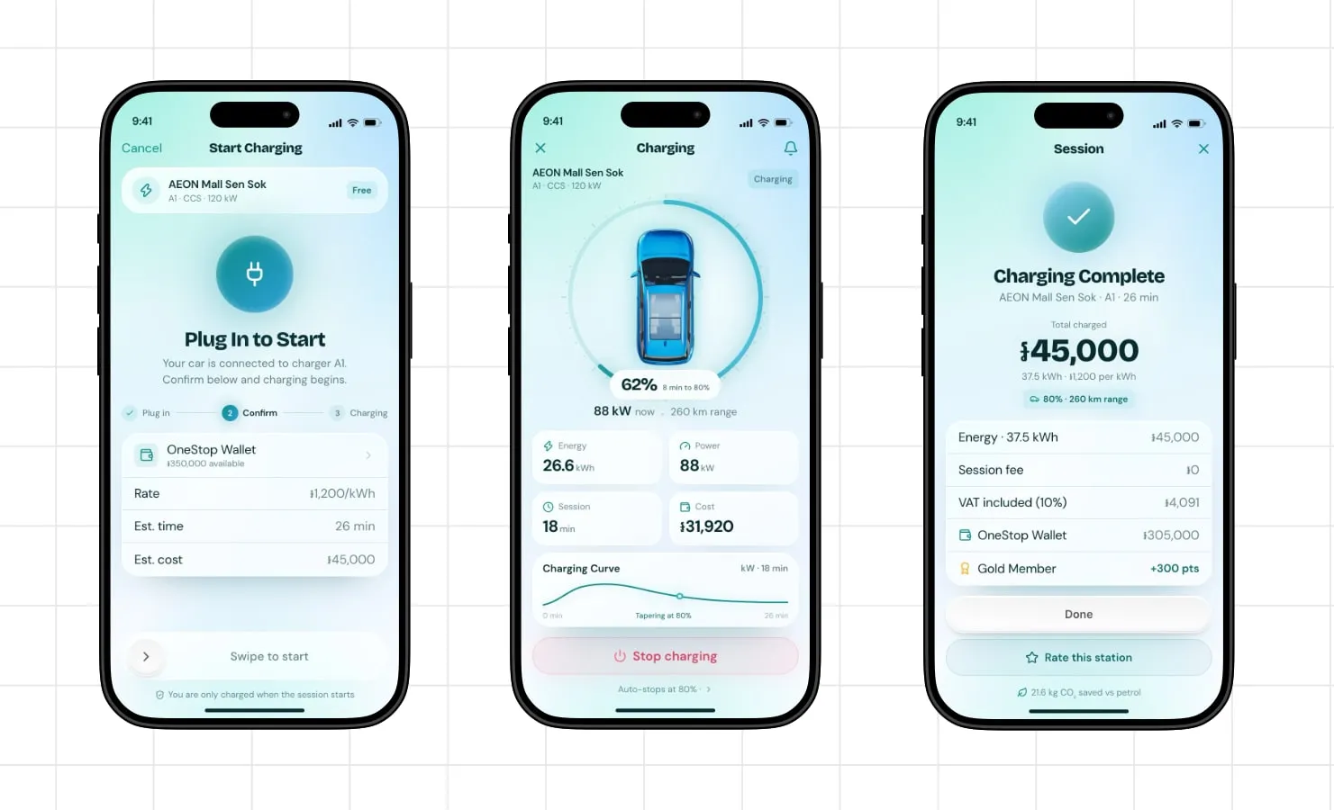
Fig. 5: Charging. Confirm, live session, receipt.
The start screen is a confirmation, not a dashboard: the charger you are on, the rate, the estimated time, the estimated cost, the wallet balance it will come out of, and one honest line at the bottom: you are only charged when the session starts.
Why: this is the moment of doubt. Someone is standing in a car park deciding whether the app will take their money for nothing. The screen’s job is to remove that fear, in that order: what it costs, where it comes from, and what happens if you back out.
The action is a swipe, not a tap. A wet thumb in a car park should not be able to start a session by accident.
While charging, the screen shows the two numbers that decide when you can leave, 62% and 8 min to 80%, with energy, power, session time, and cost underneath. The charging curve includes the explanation most apps leave out: tapering at 80%. Otherwise a slow charger looks like a broken one.
The flow ends with a receipt, not a thank-you. Total, energy, session fee, VAT included, wallet balance after, points earned, CO₂ saved. For anyone charging on someone else’s account, that receipt is the product.
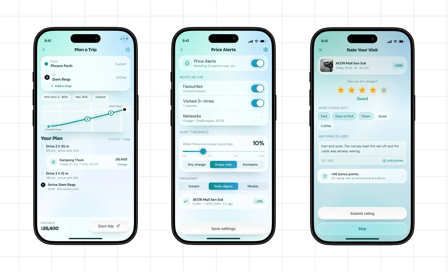
Fig. 6: Trip planning, price alerts, rating. Every leg shows arrival battery and cost.
A trip planner that ignores range is just a map. Pick a destination and this one tells you where you will stop, how long it takes, what it costs, and what you will arrive with: drive 2 h 35 m, arrive at 42%, charge 22 minutes at Kampong Thom for 26,400 riel, drive 2 h 15 m, arrive in Siem Reap at 19:48 with 18% left.
Why: the anxiety is less about where the charger is than whether you will get there. Answer the second question and the first becomes a detail. The Min 20% control treats the battery as a floor, not a target. The plan should never strand you to save ten minutes.
The third screen is where the review on the charger page comes from. Rating a session asks for stars and a few chips (fast, easy to find, clean), and pays 40 points for a comment and a photo. Structured enough to aggregate, cheap enough that people finish it. The line you read under the AEON listing (“Canopy keeps the rain off and the cable reaches. Two bays free at 6pm.”) is the output of this screen, not a testimonial someone wrote for a website.
Price alerts sit on the same idea at a smaller scale: tell me when the station I already use gets cheaper. Drops only, daily digest. The threshold is a percentage rather than a fixed amount, because 200 riel off a 1,200 riel rate is noise during a price war, and 200 riel off 950 is a reason to drive across town.
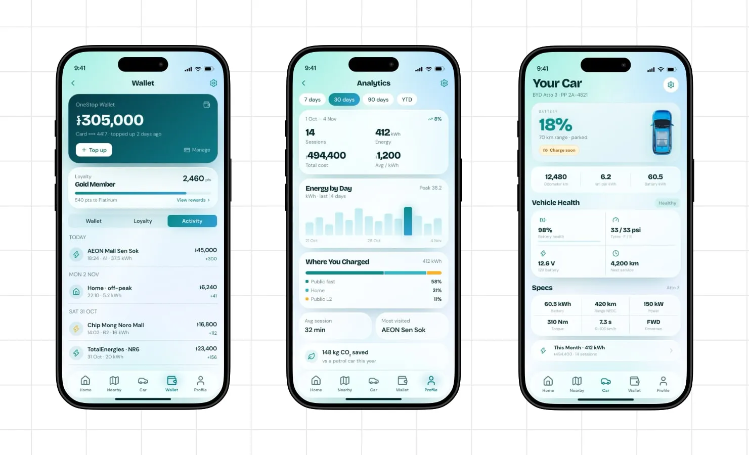
Fig. 7: Wallet, analytics, car. The unglamorous half of the product.
These are the screens that carry the relationship after the first charge.
Wallet shows the balance, the loyalty tier, and the activity in one scroll, because those are the same question asked three ways: what do I have, what is it worth, and where did it go. Analytics answers money questions rather than vanity metrics: 412 kWh, 94,400 riel, 1,200 riel average, and where it was spent, 58% public fast and 31% home. Your Car puts battery health next to tyre pressure next to the next service, because a driver who is already worried about range is one warning light away from worrying about everything else.
These are the screens AI writes most convincingly and designs most poorly. They are almost entirely hierarchy and almost no novelty. A wallet with a beautiful balance and an unreadable transaction list is a poster, not a product.
Both were on the home screen, and only there. Everything else was designed once, in the language the home screen eventually spoke.
The model’s version was structurally sound and visually anonymous. A blue gradient behind everything, every surface glassy, every card floating on its own shadow. The battery warning and the primary action were both pills of similar weight, so the screen had two things shouting and nothing leading.
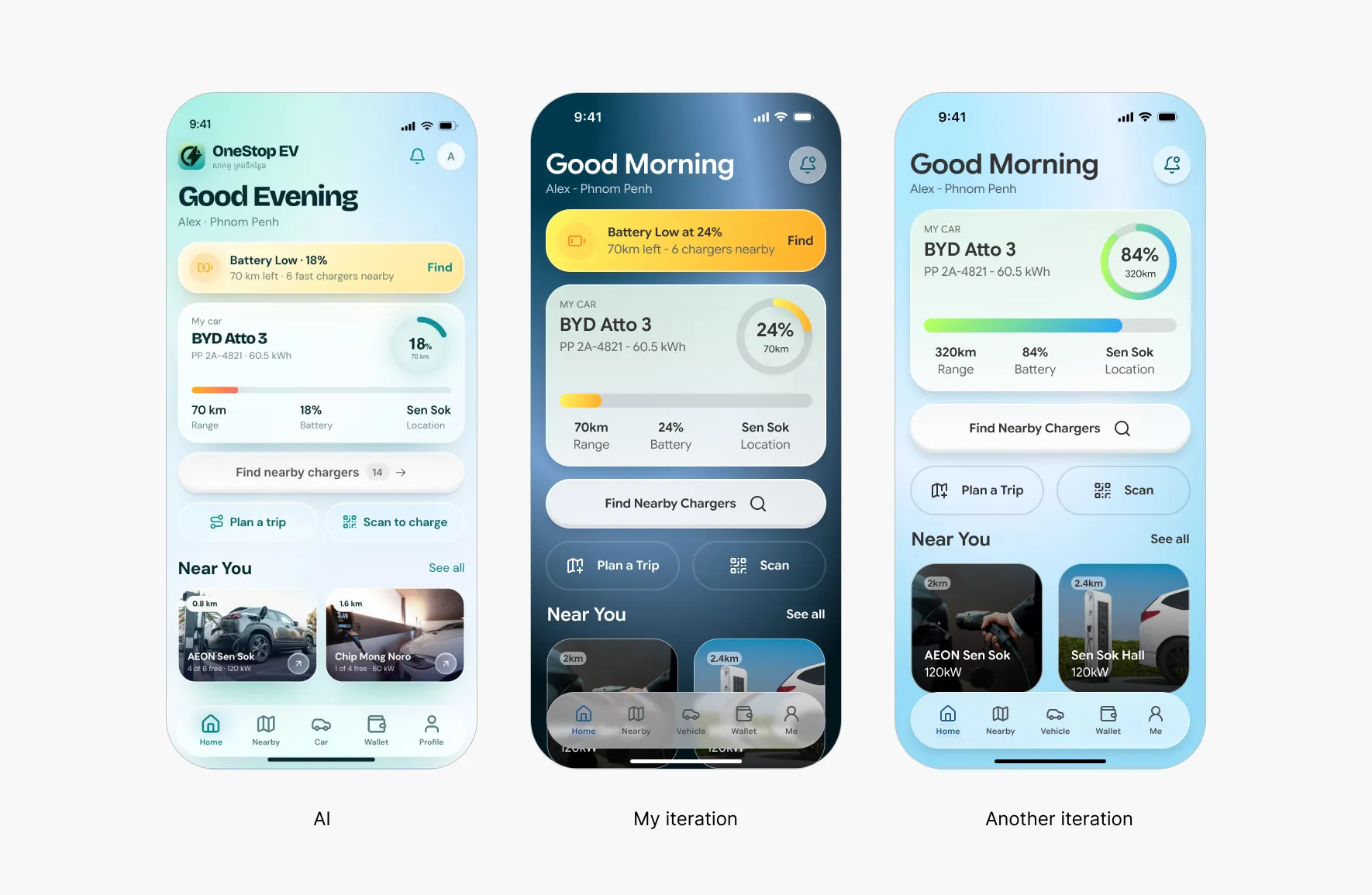
Fig. 8: The model’s home, then my two iterations. The final home (Fig. 1) applies the type and colour system these rounds produced.
My first pass went dark. Navy and teal, a yellow battery banner, a white button. It fixed the contrast problem and created a new one: with a dark, saturated ground, every element had to fight for its own edge, and the screen got louder instead of calmer.
My second pass went back to light and started subtracting. The gradient went. The glass went. The shadows went down to one soft plane. What was left was a white card stack on a near-white background, which sounds boring and is what made the hierarchy possible.
Then the pass that actually made it look like a product: Google Product Sans for everything that has to be read, and a type scale that collapses to seven steps and stays there.
Model quality sets the ceiling on all of this. A weaker model gives you worse structure and costs you more cleanup, and at some point the cleanup exceeds the time you saved. That is the real argument for using a good model. It leaves less to undo.
Using AI as the primary design tool made the prototype arrive early enough to judge. I could see the whole product, test whether the idea held together, and change the home screen twice without paying for it in weeks.
Polishing took the same work as always. The only difference was starting from someone else’s draft instead of my own.
The model sets the ceiling. AI makes the prototype faster and the vision clearer, but the polish still needs human taste.
That isn’t a complaint. A tool that gets you to a testable product faster and hands the last 20% back is doing the right amount of work.
If you want to expand this project or collaborate on your own idea, I’m available.