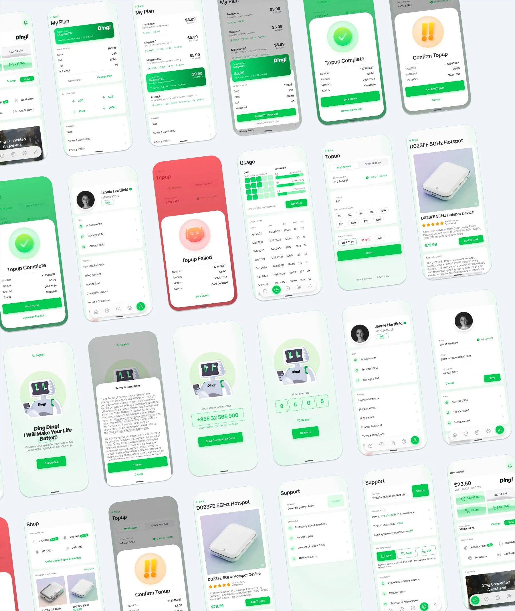
This case study explores the design of Ding!, a mobile carrier application tailored for the Cambodian market. The goal was to create a high-utility, low-friction interface that handles the complexities of prepaid plans, top-ups, and device retail within a cohesive visual system.
The name Ding! was chosen to evoke the immediate, satisfying sound of a successful transaction or a new notification. In a market where users frequently top up small amounts and manage data in real-time, the brand needed to feel instantaneous and reliable. It’s short, punchy, and phonetically simple—essential for cross-language brand recognition in Cambodia.
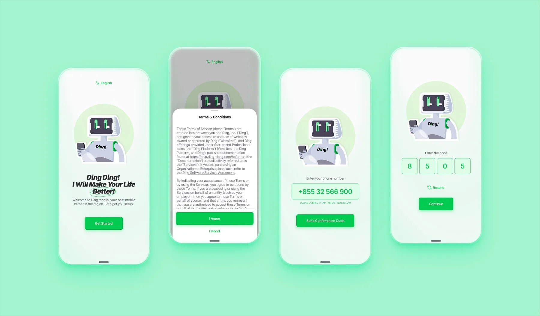
The onboarding process focuses on “Time to Value.”
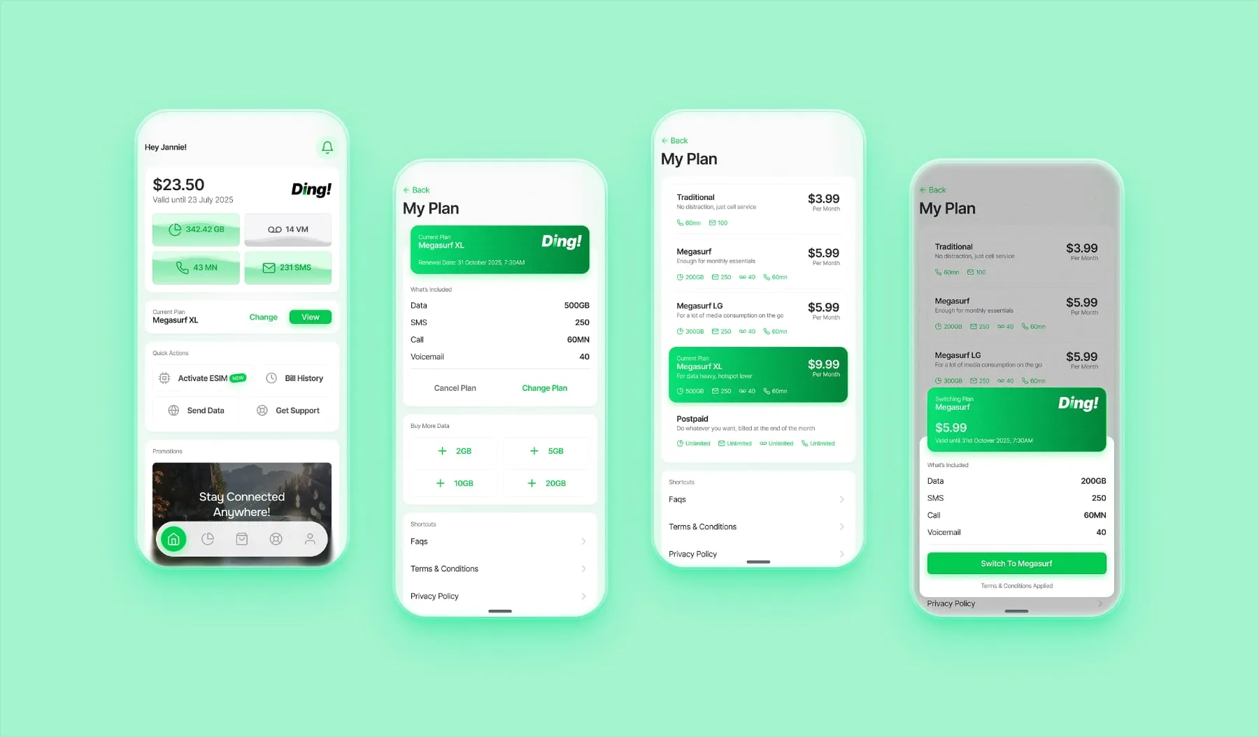
The main interface is designed to answer the user’s most urgent question: “How much do I have left?”
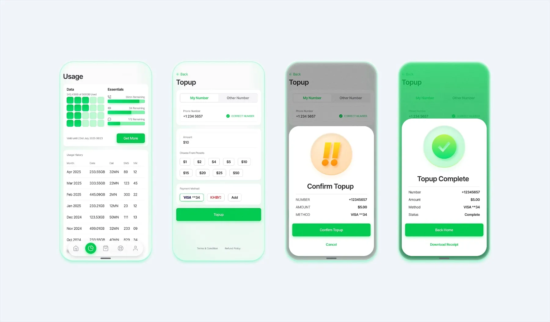
In a prepaid-dominant market, the top-up flow is the most frequent interaction.
Granular Tracking: Data, minutes, SMS, and voicemail are categorized clearly to help users manage their spend.
The “Status” System: I utilized a high-contrast color-coded system for transaction results.
Green (Success): Clear confirmation.
Yellow (Confirm): A friction point to prevent accidental spending.
Red (Failed): Immediate error recognition with actionable next steps.
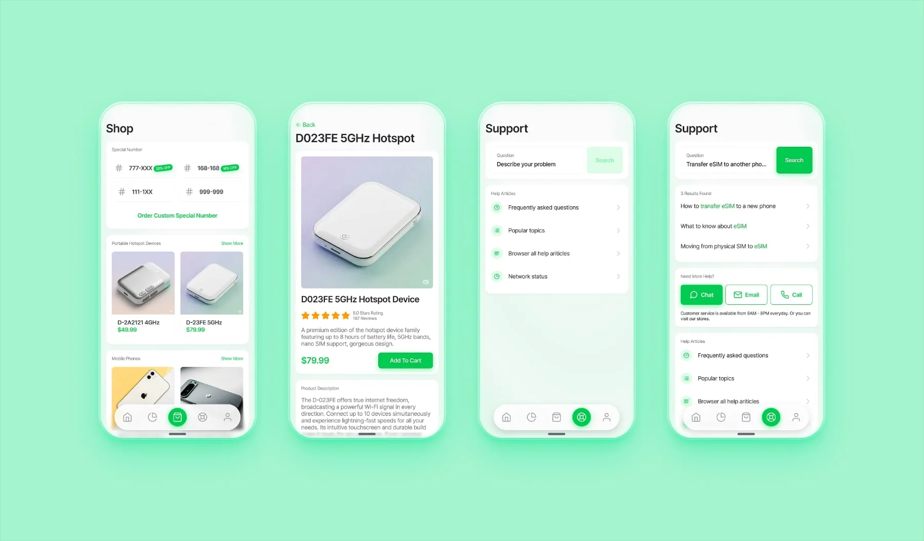
Integrated E-commerce: A streamlined shop for hardware (phones and hotspots). While the full checkout was omitted to focus on the UI grid, the layout prioritizes technical specs and clear CTA pricing.
Support-First Logic: Users are initially funneled through a robust search and FAQ system. This reduces the load on live support agents while providing instant answers for common issues.
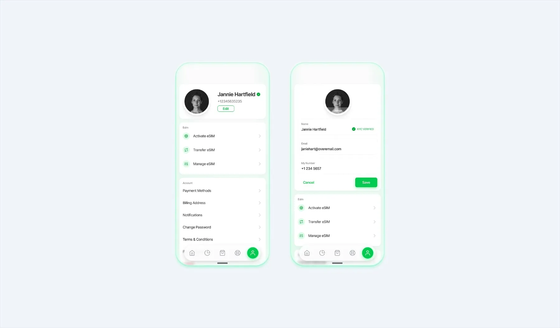
The profile section is designed for utility, providing a centralized hub for account settings.
Information Hierarchy: Important account details are surfaced immediately, while deeper settings are nested to keep the UI clean.
Editing Flow: The profile edit screen uses a focused, single-column layout to ensure data entry is straightforward and error-free.
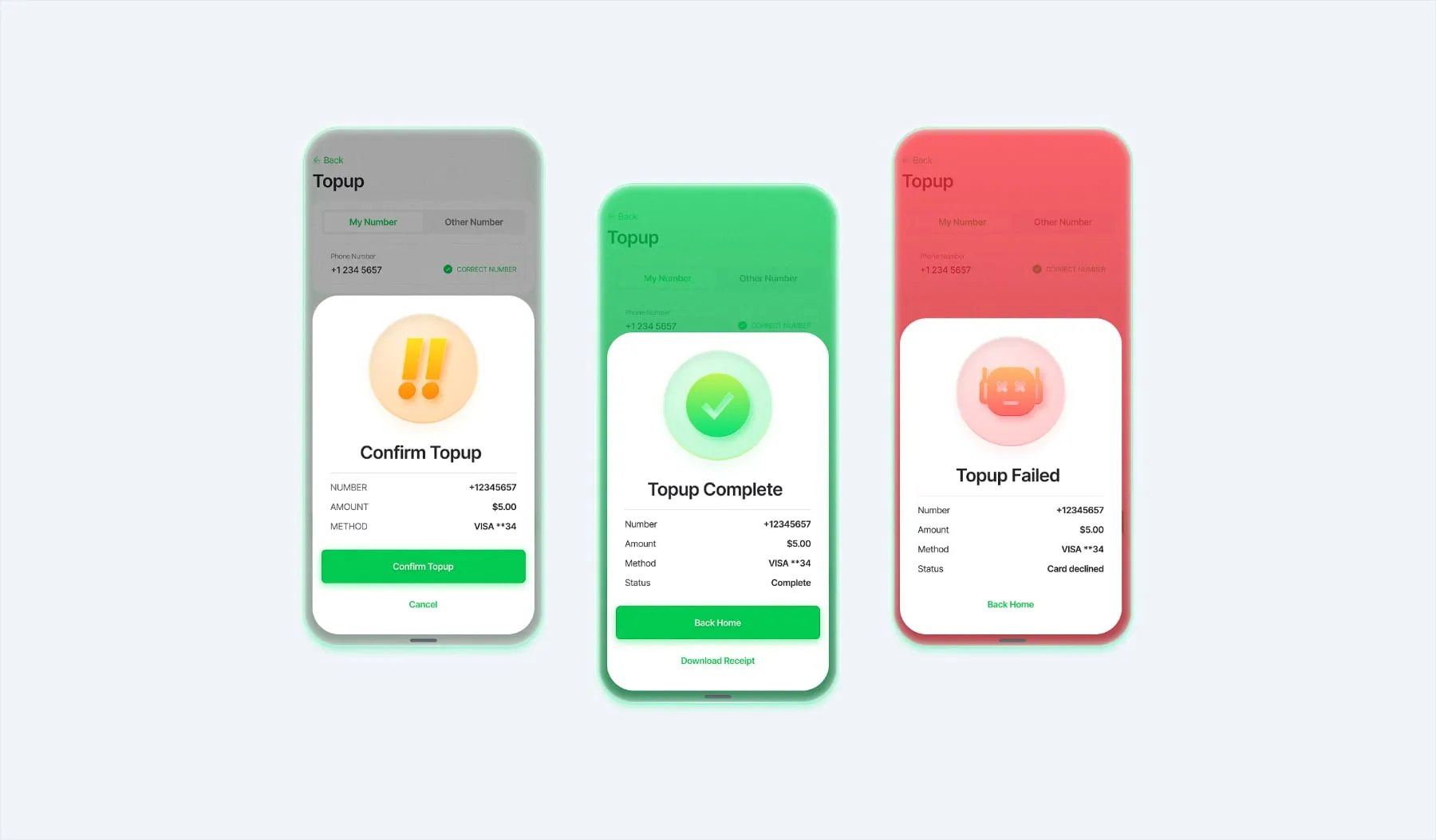
To ensure the user is never left guessing, I developed a distinctive three-state system for every major action (like a top-up or plan change).
Confirmation (Yellow): A friction point designed to prevent accidental purchases, asking the user to verify their intent.
Success (Green): Immediate visual reward and confirmation that the action was completed.
Failure (Red): Error recognition that clearly communicates an issue without being “scary,” allowing for an easy “try again” path.
Managing this project required a rigorous design system to ensure consistency across dozens of screens. I focused on a modular component library for buttons, cards, and input fields to allow for rapid iteration.
As a designer, it is crucial to recognize that an app’s UX is often dictated by a company’s operational maturity. I intentionally left out features like:
These choices were made to demonstrate a “minimum viable high-fidelity” product—one that is ready for development without over-engineering features that depend on specific business logic or physical support infrastructure.
© Copyright 2026, All rights reserved